Overwatch 2
Overwatch 2 is a first-person shooter game developed and published by Blizzard Entertainment.
This is a personal project, created for ELVTR UX/UI for gaming course
Overview
April - May 2024
Goal
Develop a UX case, for a game from the provided list. Identify an opportunity and propose modification & improvement.
Problem
How can the select character experience be updated, to assist with better countering the enemy team? At which part of the user journey should this opportunity be brought forward?
How can the new experience be optimized and inclusive for all player expertise levels? (beginner-experienced)
My role
Identify and develop opportunity from User Journey
Create E2E flowchart
Conduct short competitive analysis
Design and user test with low-fidelity prototypes
Put together a user testing plan, and present results
Iterate designs and produce high fidelity mockups
Include and double check accessibility enhancements
* Character illustrations and 3D assets, were found online and re-purposed for the project needs.
Challenges
Develop a design that builds off the current experience
Assign available controller shortcuts for intuitive ease of access
Avoid steep learning curve for players
Consider if opportunity can assist with Player Acquisition strategy (to attract new and retain existing players)
Step 1
Research and find
I put together player personas to gain a better understanding of FPS players. To understand existing problems, I researched to find what O2 players were asking in Reddit forums. Then, I created a User Journey to highlight potential opportunities. I cross-referenced the problems faced by current players with my suggestions for opportunities and decided to develop a counter-select hero experience. Additionally, I conducted a quick competitive analysis for inspiration.
Player personas
-

ShadowHunterX
Cody | 27 | Software Engineer
Cody starts their day with breakfast and checks game updates. In the afternoon, they play warm-up matches before ranked play. Evenings are for team sessions, strategizing with friends. At night, they review progress, set goals, and log off for rest.
Expectations:Thrilling FPS experience with fluid controls and intense gunfights
Varied gameplay modes including solo and team-based
Regular updates for fresh content and engagement
Motivations:
Improve skills and climb ranks for recognition
Enjoy social interactions and bonding with fellow players
Find escapism and excitement in gaming
Constraints:
Limited time due to real-life responsibilities
Need to balance gaming with work, studies, etc.
Skill disparities require adaptive strategies and balanced matchmaking
-

SilverSage72
Caitlyn | 35 | Dental assistantAfter putting her kids to bed, Caitlyn settles in for a cozy gaming session. She boots up her favorite RPG, immersing themselves in the game's enchanting world. Exploring new areas, completing quests, and interacting with NPCs, they unwind and enjoy the sense of adventure until it's time to call it a night and prepare for another day.
Expectations:
Immersive world with engaging storytelling and diverse characters
Relaxing gameplay suitable for unwinding after a long day
Family-friendly content without excessive violence or mature themes
Motivations:
Escape and relaxation from everyday stresses
Nostalgia and adventure reminiscent of classic RPGs
Bonding with family through shared gaming experiences
Constraints:
Limited time for gaming, restricted to a few hours each night
Casual skill level preferring simple mechanics and forgiving difficulty
Budget considerations regarding in-game purchases and subscription fees
Public player insights
-
Full Hero Counter Chart
“I am new to overwatch. I’m a competitive gamer who started playing since the new drop. I’m trying to learn as much as I can to catch up with the meta and how this game is played at a high level, but some of the information I read seems misleading..”
-
Who counters who?
“Starting things off, I'm silver tank and support and gold dps. I’m not the worst, but I am nowhere near decent. Could I get a list of who counters who in this game? I know the obvious ones .. but I would like to know the rest so I can play into better fights.”
-
Counter chart ?
“I have been looking for counters to certain heroes that I can't figure out myself … I am scared that if i just google it. I'll find complete nonsense … anyone know a chart or video with the counters, or generally more info on what to do against certain heroes ?”
User Journey
After crafting the player journey, I decided to focus designing the opportunity,
of recommending counter character picks against the enemy team, during a match
Competitive analysis
-

Dota - Friends and Foes
The Friends and Foes legend box, uses percentage and colored legend to indicate how good/bad your selected character is against others. It also shows how compatible or not, your character is with certain allies.
This information is helpful to quickly evaluate your character choice in comparison to how well you can combo with your team as well as how well you can counter the enemy team
-

League of Legends - Suggested items
The suggested items in LoL, informs the users about what items are best to purchase, and whom would they help fight against. The information layout and language, helps the user quickly scan and make informed decision
-

Counter pick charts for O2
There are several websites and forums that provide lists or charts of O2 counter heroes. Helpful information to study, but not easy to access or remember during a match. Especially if the player is on console
Step 2
UX design
Paper prototype
Flowchart
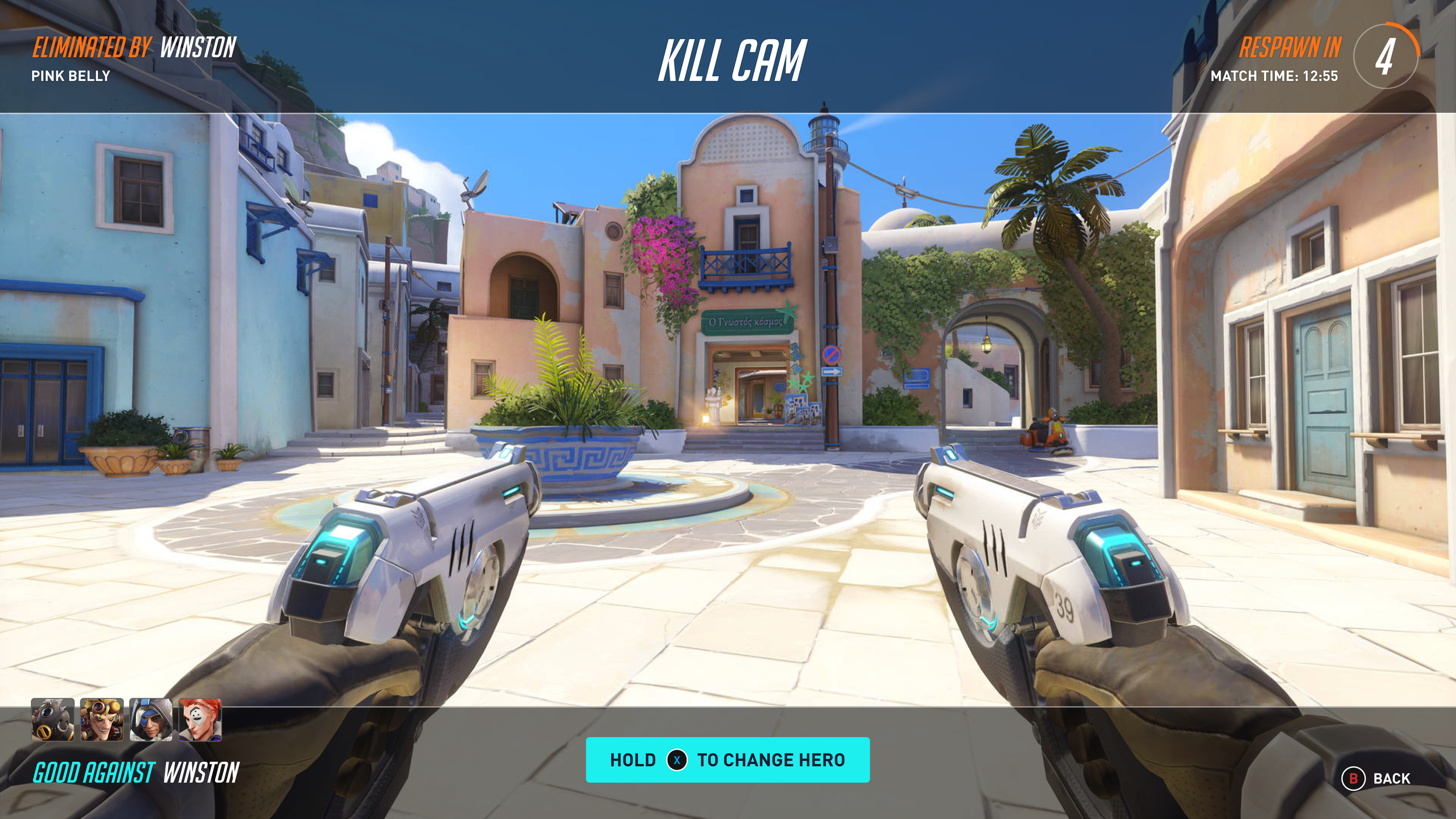
Once I completed the entire E2E Play flowchart, I delved into determining the most suitable moment to introduce the counter-picking experience to players. After careful consideration, I concluded that the best timing for presenting counter selection to users would be during the match, either within the Kill Cam sequence or immediately following auto-respawning. This hypothesis forms the basis for my upcoming usability testing, through which I aim to gather more insights.
Full E2E Play flow
Wireframes
-

Kill Cam screen
-

Character select screen
Step 3
Usability test
Plan protocol
Objectives
Evaluate new “counter pick suggestion” feature with players and understand discoverability issues and or communication gaps.
Can players understand all the information and options on [Kill cam screen] without assistance? If no, why?
Can players understand all the information and options in [Character select Screen] without assistance? If not, why?
Do players see value in the information provided in both screens? If not, why?
How do players feel about the feature design on both screens?
If players had a magic wand, to change anything, what would that be?
Logistics
Recruitment:
Target audiences: 16-55 years old
Play FPS games.
Experience level: New-Expert
4 testers
Platform:
Figma wireframe prototype
Schedules:
Date: 04/29/24 - 05/01/24
Moderated sessions
Tasks
Go through and describe what they see in each wireframe (Kill Cam & Character selection)
Point/Click/Speak - change characters.
Point/Click/Speak - select a counter hero
Speak out loud as they go through the screens.
Express usefulness (positive/negative) of feature and in what scenarios
User feedback
All the users:
Understood the feature concept
Would use the feature if they kept getting killed by 1 enemy
Would use the feature if there’s 1 target the whole team wants out
Found the legend easily
Found the text/language clear
Half the users:
Didn’t think the feature would be useful, for targeting 1 enemy
Kill Cam screen
All the users:
1) Would prefer to see more hero counter options that just one
Half the users:
2) Misunderstood who the legend was referring to, due to placement location
Character select screen
All the users:
1) Found the iconography and color helpful and clear
2) Would prefer to see counter options for the whole enemy team, not just 1 enemy.
Half the users:
3) Misunderstood who the legend was referring to, due to placement location
Follow up iterations & assessment
Step 4
UI Design
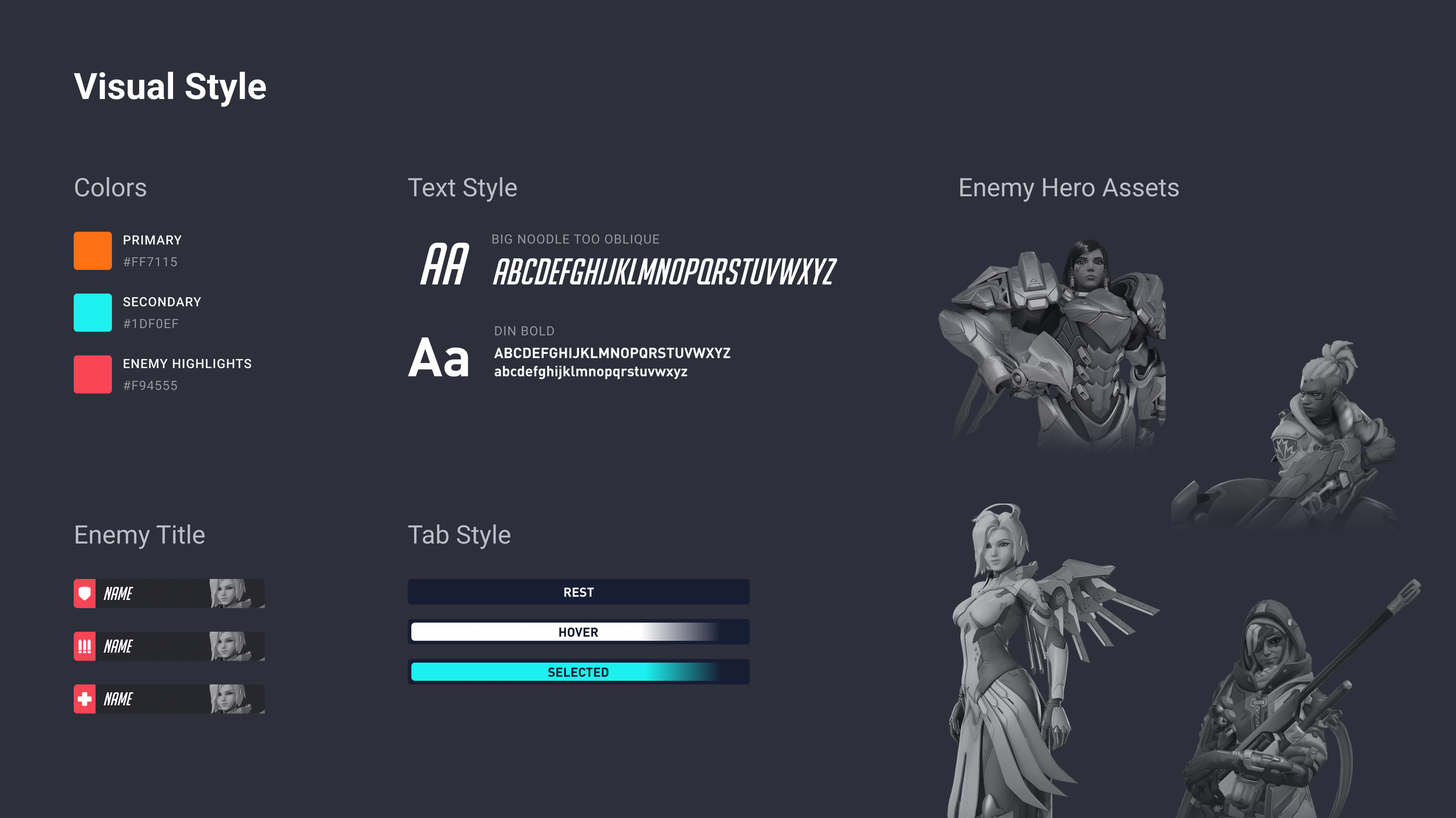
After finalizing my wireframe design, I applied a UI treatment that’s building off the game’s design language. I re-utilized existing UI states from other parts of the game to ensure familiarity among players. Moreover, I incorporated the familiar red color hue to depict the enemy, along with maintaining the layout of icons and hero pictures, consistent with the game's established design.
High fidelity mockups
Decisions and thoughts
Kill Cam is placed on header, like titles are expected to
‘Good against’ is placed close to the counter hero options
More heroes are visible, to entice players to change to a counter
CTA is on same eye height as hero squares, for faster info connection
Opportunity to have hero squares be quick-selected from here
Decisions and thoughts
Utilized existing selection method, to avoid learning curve
Filter tabs are placed in close proximity to hero squares, and my currently selected hero
Tab strings and selected states, to help understand in what filter mode players are
Controller shortcuts are placed in intuitive locations
(RB-right tab active, LB-Left tab active)Enemy names are displayed with picture for quick scan
Counter heroes options, placed under each enemy name, for clearer association by location
Development cost could be lower, because design is created within current constraints/layout format
AI opportunity to provide the suggestion of counters per enemy. And update as enemies change their heroes
Accessibility assessment
After conducting color blindness accessibility check, I updated color opacities and hues, so that there’s enough contrast ratio
Figma interactive prototype
“The world could always use more heroes”
Click on tabs, to view hero options
Click ‘Back’ to view Kill Cam, screen


